Leveraging user insights to improve the donation process and prioritize new feature requests
Every.org is a technology platform that connects people and nonprofits through a simple and social giving experience. It’s designed to make charitable giving easy and joyful. Thousands of people across the U.S. choose Every.org because:
- It’s easy to use — One can manage all their giving in one place, get one tax receipt at the end of the year, and never forget about a recurring donation.
- It’s privacy-first & secure — One doesn’t have to share their contact information with a nonprofit to support them. All donation transactions are secured through Stripe and Plaid which are industry leaders in online payments processing.
- It helps nonprofits reach more people — People are more likely to support nonprofits that other people donate to. When one makes a donation on Every.org and shares their activity with the community, they’re effectively supporting nonprofits twice with the ripple effect of giving.
Challenges
At the beginning of 2021, the team at Every.org wanted to:
- Find a user research solution that can be set up and used without any help from the development team;
- Have full control over the way their microsurveys look;
- Identify the exact reasons why some people started donating but didn’t complete the process;
- Prompt feedback questions after certain interactions on the platform;
- Prioritize their user experience updates based on requests from platform visitors;
Table of Contents
3 steps Every.org took to improve their donation experience and feature prioritization
Step #1 Created their feedback portal and published their first microsurvey
The team at Every.org learned about Appzi from Google’s search results and registered for the service in four easy steps. They’ve set the initial settings and started collecting general visitor feedback through our customizable product feedback template. This template helped them understand what users loved about their platform. It also collected feature requests and insights on where they could improve.
Microsurvey implementation took less than five minutes, as it required adding one line of code in the <head> section of the platform. Take a look at the registration process and microsurvey’s settings setup below.
Step #2 Customized and published the second microsurvey to understand the reasons why people didn’t go through with their donations
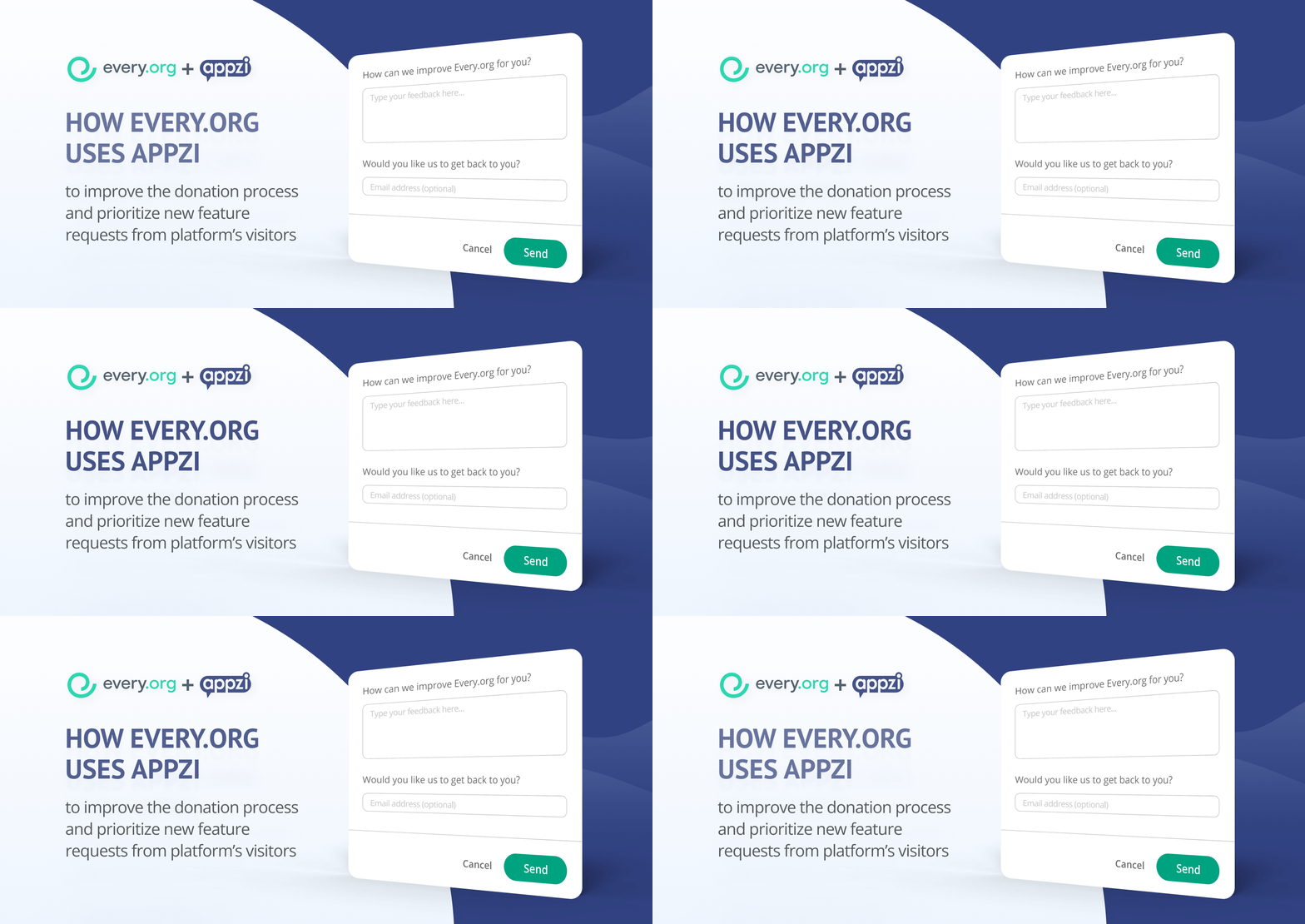
Every.org asked our team to set up an advanced trigger for their second microsurvey. Specifically, the microsurvey had to be visible only to those users who didn’t complete their donation. Thanks to subtle targeting, the team learned that there were some technical and organizational challenges with the donation form itself. Every.org prioritized and solved them in no time. Check out the microsurvey the team uses to collect insights from their visitors.
Step #3 Prioritized and acted on the feedback they’ve received
Knowledge is power, but without action, it’s just … knowledge.
Every.org took the insights it learned from Appzi’s interactive, in-product microsurveys and turned them into tangible platform improvements.
Specifically, thanks to the comments the team received new charity categories and payment options that appeared on the platform, which had a positive impact on the number of donations.
In addition, the team found the option to respond to peoples’ comments right within their inbox, without having to log in to Appzi every time they got a new piece of feedback — extremely convenient for closing the feedback loop.

How you can replicate the success of Every.org
- Obtain qualitative and quantitative data in context: Capture hyper-relevant insights by targeting specific users during specific moments throughout the customer journey. This means asking for feedback at the moment — right after they closed the donation form, in the case of Every.org.
- Let your customers tell you what they need: Don’t make assumptions! Instead, rely on customer feature requests to work on your roadmap. For the team at Every.org, this meant that they needed to actively ask what their users loved about the platform and what aspects needed improvements.
- Capture data continuously: Your customer and product are always changing, so you should be capturing constant insights to keep up with those changes. Continuous findings mean constant learning and quicker user experience improvements. All of which benefit users and, in turn, the organization.
